

A painted wooden door and a polished metal door can share the same outline, yet suggest very different places. Grain, reflections, scratches and changes in colour tell the viewer something about each surface before any explanation appears. These details help an illustration communicate what an object is made from and how it belongs within its surroundings.
Digital game art uses this visual language across characters, scenery and symbols. Although the image appears on a flat screen, it can suggest roughness, softness, weight or shine through carefully chosen marks. Looking at those choices reveals how artists give a setting character without needing every object to look photographic.
Material Starts With a Few Recognisable Clues
An artist does not need to reproduce every feature of a surface to make it convincing. A few directional lines can suggest wood grain, while uneven edges and broken tonal patches can give stone a weathered appearance. What matters is selecting the clues that remain visible and support the shape of the object. Adding detail everywhere can make the material less clear if the underlying form becomes difficult to read.
Different entertainment themes provide useful starting points for comparison. The catalogue of Mr Q casino slots includes Book of Dead, Big Bass Splash and Starburst, bringing together titles with different visual themes. These offer a context for examining how illustrated objects and surfaces contribute to a game’s identity, without assuming that the artists behind them used the same techniques or software.
The useful exercise is to look beyond the name of the theme. Ask which marks establish a surface, how the object catches light and whether those choices agree with the surrounding artwork. A bright decorative symbol and a weathered background can work together, provided their differences feel deliberate. Texture becomes part of the composition rather than a layer of detail added indiscriminately.
Highlights Help Separate One Surface From Another
Light provides some of the strongest clues about material. A sharp highlight can suggest a glossy finish, while a softer transition may imply a duller surface. Reflections also change with the shape of an object, so the same material can look different on a curved form and a flat panel. Artists use these relationships to give objects volume as well as a recognisable finish.
The choices need to remain coherent within the image. If every object receives the same bright edge and reflective treatment, wood, cloth and metal may begin to look alike. Adjusting the width, strength and placement of highlights helps distinguish them. This does not require strict realism, because a stylised illustration can exaggerate those differences while still giving each material a consistent visual character.
Texture Has a Place in Traditional Art Too
The questions raised by digital surfaces connect with an established element of art. The National Gallery of Art’s educational resource on texture encourages learners to identify textures in artworks, consider the materials and techniques used to create them, and experiment with different media. That approach provides a useful foundation for examining how artists communicate surface qualities.
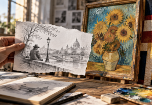
There is a distinction between an artwork’s actual surface and the surface it depicts. A drawing on paper may suggest coarse stone through marks that are themselves relatively flat. Digital artwork similarly creates an impression of material through visible information. A viewer cannot feel the illustrated surface, but can recognise qualities associated with familiar objects, making texture a bridge between observation and interpretation.
Weathering Can Suggest a History
A worn edge or faded patch can imply that an object has been handled, exposed or repaired. These details give scenery a sense of use, helping a setting feel inhabited. A wooden sign with uneven paint suggests a different history from a newly finished panel, even when both display the same words. The artist can introduce that difference through a small number of carefully placed marks.
Weathering works best when it follows a plausible pattern within the chosen style. Areas that project outward might show wear, while sheltered recesses could remain darker or collect dirt. Random scratches scattered evenly across an object may look decorative without explaining anything about it. More selective treatment gives the viewer clues about the object’s imagined life and keeps its main features clear.
Stylised Surfaces Need Their Own Internal Logic
A game illustration can use simplified shapes, exaggerated colours and unusual lighting while still communicating material effectively. A cartoon stone wall may have oversized cracks, and a painted jewel may carry a highlight much larger than a real reflection. Those choices belong to the style when they recur consistently and support the intended character of the artwork.
The challenge is to make neighbouring objects feel part of the same visual world. A highly detailed photographic texture can appear disconnected from a character drawn with broad, simple shapes. That combination may be intentional, but it needs careful handling. Artists can bring elements closer together by adjusting contrast, simplifying detail or using a shared approach to edges and shading across the composition.
Detail Should Match the Size of the Image
Texture that looks attractive in a large working file may become visual noise when reduced. Fine scratches can merge, small patches can lose their shape, and subtle grain may disappear entirely. The artist therefore needs to consider how the image will actually be viewed, especially when symbols or illustrated objects occupy only a small part of the screen.
A useful design can work at more than one scale. Its outline and major tonal areas establish the object from a distance, while smaller details reward closer inspection. This hierarchy gives texture a supporting role rather than asking it to carry the whole image. Checking artwork at its intended display size helps reveal which marks contribute to recognition and which simply crowd the surface.
Quiet Areas Make Richer Surfaces Easier to Appreciate
Texture becomes more noticeable when it has something simpler beside it. A rough wall can stand out against a calm sky, while an ornate object gains emphasis when its immediate surroundings contain fewer competing details. This relationship gives artists a way to guide attention without increasing brightness or adding another decorative element.
The same principle helps when artwork shares space with text and controls. Busy patterns behind important information can make the screen harder to follow, while quieter areas give that information room. A considered composition does not require removing visual richness. It distributes that richness so the setting remains interesting and the practical elements remain readable.
Looking Closely Reveals the Choices Behind the Surface
Examining digital game art through texture encourages a more precise kind of observation. Instead of describing an image only as colourful or detailed, the viewer can notice the marks that suggest grain, the highlights that imply polish and the worn areas that give an object history. Those observations make it easier to understand why two illustrations of the same subject can feel so different.
Texture contributes to the visual identity of a game, while its rules and outcomes remain separate matters. Its creative value lies in helping artists turn familiar shapes into objects with character. Through selective detail, coherent lighting and careful composition, a flat image can suggest a world of surfaces that the viewer recognises.

























0 Comments on "Texture in Digital Game Art: Giving Flat Images a Sense of Material"
Would you like to share your thoughts?
Your email address will not be published. Required fields are marked *