
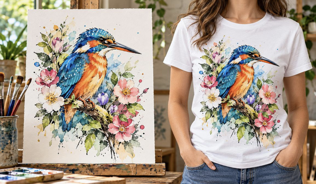
From Sketchbook to T-Shirt
A finished drawing or painting already contains the hard part: the artist’s decisions. Line weight, colour, texture, composition and small irregularities make the piece recognisably yours. The challenge begins when that physical original needs to become a digital file suitable for printing on clothing.
That transition usually doesn’t mean redrawing the artwork from scratch. You can often reproduce a pencil drawing, ink piece, watercolour or painting successfully if you capture it with enough detail and prepare it with care. The goal is not to make traditional work look cleaner or more digital, but to preserve its qualities while removing only what interferes with reproduction.
Before thinking about scanners, cameras or file formats, however, you first need to make a more basic creative decision: what part of the artwork actually belongs on the garment?
Choose what the garment should actually carry
A strong piece of artwork does not automatically need to be reproduced edge-to-edge on a T-shirt. The original may work beautifully as a complete composition on paper or canvas, but clothing introduces a different shape, scale and visual context.
Sometimes the whole piece is the right choice. A detailed ink drawing, for example, may rely on the relationship between every element in the composition. In other cases, a crop can be stronger because it gives one part of the image more presence on the garment. A single figure, symbol, painted object or section of linework may also work better when isolated from the rest of the page.
Traditional media behave differently too. Fine pencil marks can disappear if you reduce the design too much. Charcoal may rely on soft tonal transitions that become muddy if contrast is pushed too aggressively. Watercolour often depends on transparency, paper tone and subtle edges, while acrylic or gouache can produce stronger blocks of colour that hold up better when enlarged.
The background deserves the same consideration as the subject. If the paper colour, torn edge, brush bleed or canvas texture is part of the artwork, removing it automatically may weaken the piece. On the other hand, a clean white paper rectangle may feel awkward when placed on a coloured shirt if the artist never intended that border to become part of the design.
Negative space can also be important. A composition that feels balanced on paper may feel crowded on clothing, simply because every spare area gets filled. The garment itself adds space around the artwork, so the original doesn’t need to occupy the largest possible print area.
A useful test is to make three versions before detailed preparation: the full artwork, a deliberate crop and one isolated element. Treat each as a garment composition. The strongest choice is the version that still feels true to the artwork while making sense on a body rather than on a page.
Once you’ve made that decision, the next task is capturing the original accurately enough to work with.
Digitise the original without flattening it
Scanning is usually the simplest route for flat artwork that fits safely on a scanner bed. Pencil, ink and many works on paper can be captured very cleanly this way because the artwork stays flat, lighting is controlled, and the image is recorded evenly across the surface.
Resolution needs to be judged in relation to the final print size, though. Around 300 dpi at the original size is a useful benchmark for print, but that doesn’t mean every scan at 300 dpi will work for a large garment print. If you plan to enlarge a small drawing significantly, you need more information at the start. Increasing the DPI value later in software cannot recreate detail that was never captured.
Photography becomes more useful when the artwork is too large for a scanner, has a textured surface, sits on canvas or board, or should not be pressed against glass. Fragile or valuable originals may be safer to photograph than force through unsuitable equipment.
Use even lighting, keep the camera square to the artwork and avoid glare, reflections and heavy shadows. A stable, high-resolution capture matters more than an elaborate camera setup. The test is whether the image preserves enough detail, colour and tonal balance at the size it will eventually be printed.
A good phone photograph is not automatically unsuitable. Modern phones can capture excellent detail in good conditions. The test is whether the file holds up at the intended output size and reproduces the original accurately enough to work from.
Colour needs particular care with paintings and water-based media. A screen image can look convincing while still shifting the original’s balance. Warm paper may become neutral, subtle washes may look heavier, or a saturated paint colour may move noticeably depending on lighting, camera processing and display settings. Comparing the digital capture directly with the physical artwork before editing helps prevent those changes from being mistaken for part of the original.
Texture can be just as important as colour. Pencil grain, charcoal softness, brush marks and the surface of paper or canvas all contribute to the work’s character. A technically sharp capture that flattens those qualities may be less useful than one that retains them.
The aim at this stage is not to create a finished print file. It is to create the best possible digital record of the original, with enough information to make careful decisions afterwards. Once the capture is strong, the next step is deciding what to correct for reproduction and what to leave alone.
Prepare the file without erasing the artist’s hand
Once the capture is strong, digital preparation should be selective rather than automatic. Cropping and straightening are often straightforward, and minor tonal or colour adjustments may help the file match the physical piece more closely. The harder judgement is deciding which marks are defects introduced by the capture process and which are part of the work itself.
Dust, scanner specks or an accidental shadow can usually be removed without changing the piece. Pencil grain, charcoal softness, uneven brush texture and small variations in tone are different. Smoothing those away may make the file look cleaner on screen, but it can also make it less recognisable as the artist’s own hand.
Background removal deserves the same restraint. If the garment colour is meant to replace the paper, a transparent background can work well. If the paper tone, torn edge or painted ground forms part of the composition, removing it may strip away context that the piece needs. There is no universal rule that says every design should sit on transparency.
Sharpening, contrast and upscaling need the same restraint. Used carefully, they can help a file reproduce more clearly. Used aggressively, they can exaggerate edges, flatten soft transitions or invent a false sense of detail. Upscaling can increase pixel dimensions, but it cannot recover texture or line information that was never captured in the first place.
Moving from traditional artwork to digital production isn’t simply about getting an image onto a computer. The challenge is preserving the qualities that made the original worth reproducing in the first place.
To explore that transition, we spoke to Matt Brussels, whose experience spans traditional illustration, digital design and garment printing. Before establishing The T-Shirt Bakery, he trained in traditional art and illustration, subsequently moving into digital design and eventually garment printing. That experience across different creative disciplines has shaped his approach to preparing original artwork for reproduction.
‘One of the things you learn when you’ve worked with both traditional and digital artwork is that they’re two very different ways of working. With a pencil drawing or a painting, you’ve got subtle textures, variations in tone and little details that are part of the original piece. When you digitise that artwork, the temptation can be to clean everything up, but sometimes you end up removing the very things that gave it character. The important thing is knowing what needs correcting for print and what should be left alone.’
A useful final check is to view the file at roughly the size it will appear on the garment rather than only zoomed in on a monitor. Fine marks that look perfect at 200% may disappear at real-world scale, while small dust spots that seem distracting on screen may be invisible in print. The goal is faithful reproduction at the size people will actually see it.
Turn the digital file into a wearable composition
Once the file is ready, the garment becomes part of the visual decision. Colour, placement and scale can change a piece’s character as much as the digital preparation did.
A pale drawing may need a darker garment to stand out, while a painting with a strong light background may work better on a colour that doesn’t compete with it. If the paper or painted ground remains visible, consider how that rectangle sits against the shirt. If you remove it, the fabric colour will effectively become part of the image.
Scale matters too. A large front print can make a painting or detailed drawing feel like a poster, while a smaller placement may feel more intimate and wearable. Neither is automatically better. Base the decision on the composition and type of mark-making, not a standard print size.
When developing custom illustrated T-shirts, it helps to judge the work on a garment mock-up before production, but a mock-up is still only a visual approximation. Fabric texture, ink behaviour, garment colour and the print’s physical size can all affect the result once it’s off-screen.
DTG can suit detailed, full-colour work because it can reproduce complex imagery without reducing it to a small number of flat colours, but that doesn’t make it the automatic answer for every piece. The garment, tonal range and printer setup all influence the result.
Colour should also be treated realistically. A scanned or photographed painting passes through several stages before it reaches fabric: capture, editing, monitor display, garment colour and the print process itself. Exact colour matching across all of those stages should not be assumed. The aim is a convincing reproduction that respects the source’s character and balance, not a promise of perfect visual identity between paper, screen and cloth.
Where the piece relies on subtle gradients, fine pencil work or delicate tonal changes, a physical sample can be more informative than further mock-up adjustments. It shows whether the scale feels right, whether fine detail survives and whether the shirt colour supports or fights the image.
Preserve the art, not just the image
Turning a drawing or painting into clothing is not really about making a digital copy. It is about deciding which qualities need to survive the change of medium.
Start with one piece. Decide what belongs on the garment, capture it with enough detail, correct only what interferes with reproduction and keep the marks that give it character. Then judge the result at garment scale, not just on screen.
The most successful version may not be the cleanest file or the largest print. It is the one that still feels like the same piece after it has moved from paper or canvas onto fabric.























0 Comments on "From Paper to Fabric: How to Turn Original Drawings and Paintings Into Wearable Art"
Would you like to share your thoughts?
Your email address will not be published. Required fields are marked *